Blog Redesign
June 15th, 2006I’ve noticed that people are slowly discovering the new design of the blog. I meant to write a post about it when I “made it live” a week or so ago, but I have been putting it off for some reason. I think I didn’t want to waste a whole post on talking about my new design, without giving some interesting facts about how NodeBox facilitated and inspired the design. Anyway, this is the story of how I liberated myself from Kubrick! (The default WordPress theme). In fact, my blog has been so “vanilla” in its design for the first year of its existence, that it may be inappropriate to even call this a redesign. Short of picking a color, this is about the only design I’ve ever done for it (and apart from the banner and some minor CSS tweaks here and there, it’s still Kubrick at the core!).
The Story of the Banner
I was playing with one of the NodeBox libraries called Pixie, which is designed to make simulated “scrawled writing.”
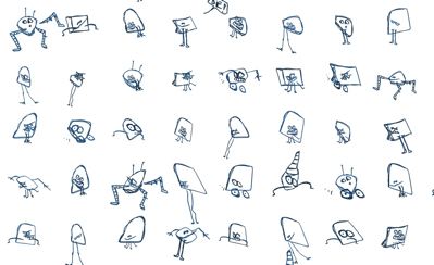
It even includes some crazy “doodles” where it creates pseudo-random sketches of creepy little guys. I made this example wallpaper using a grid of creepy guys:
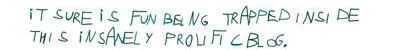
Finally I played with the crazy “graph generation,” which is a feature by which a nearly illegible graph is produced based on a specified list of nodes. You can only play with stuff like this for so long before you start indulging the ego. So I plugged some blog-oriented text in:
I decided to play with the little scribbled circles, add some color, and put them in a grid format with some blog-oriented text in them.

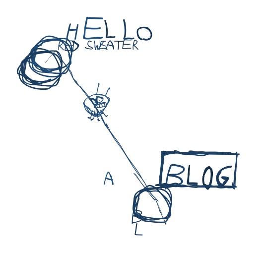
Pretty! Did I mention I love NodeBox? By now I was starting to theoretically consider my playful tinkerings to be the possible basis for a new blog banner. So I decided to pick a more realistic layout for a banner.
This is starting to look pretty cool. But I came to terms with a couple facts. First, the scribble look is cute but doesn’t give a clean appearance that I want to associate with my blog and business. Second, I better stick with a red color scheme unless I want to change the name of the company to AquaGreen Sweater Software.
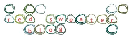
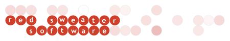
I had already toyed with plain circles as a means of giving the text in the design a little pop and stability. So I thought I’d just abandon the scribbles and use all perfect circles. The logic behind the generation is basically this:
- On an NxM grid, randomly choose whether to render a circle or not.
- If a letter is to be rendered at a given location, a circle is always rendered in a particular color (opaque red).
- For all other circles the color is rendered as a randomly color in the red ballpark.
- Letter locations are “nudgeable” by an array of x/y nudge parameters.
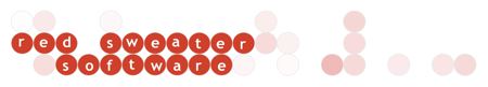
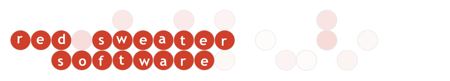
After much tinkering, I ended up with a solution that was close enough that I did a few finishing touches by hand and called it done. But I liked the results so much that I started almost immediately thinking of doing a similar design for the Red Sweater Software home page. This time I decided to make it all work from code the way I wanted it, and am therefore able to randomly generate new banners at will. The quality of these sucks but it’s just because I scaled and converted them for easy demonstration in the blog. Not every one has to turn out perfect – with NodeBox I can just run it until I see a result I like. The balance of colors and placement has to be nice. In my script I am also able to “guarantee” a certain spot to be a circle, so I can enforce some positional balance as I desire.
One of the unexpected outcomes of all this experimentation and incremental design was that NodeBox helped me get comfortable with the idea of pink as a fundamental design color for my site. I don’t think I ever would have thought of using pink unless I just stumbled upon it as a variation on red. I know, silly. But it’s a fantastic realization because I’ve long had a hard time designing (such as I do) with red. It’s so strong, it’s hard to use it without overpowering the reader. The pink elements in the new design, along with the drab gray background, I believe give me some leeway to get away with the bold red while sparing the reader from saturation overdose.
Tangentially…
While I’m talking so much about NodeBox, I should mention some other cool tricks I’ve discovered. It can be fun to play with rendering text while adjusting some random number of the text’s vertices on the bezier path. This is pretty naive adjustment, just tweaking the location of a vertex here and there, but produces a dramatically “unique” look:

And finally on a more practical level I decided to use NodeBox to design some new toolbar icons for FlexTime.

Now, these icons are nowhere near the quality you’d get from an excellent designer, but they’re much better than I would probably come up without NodeBox. It makes me so comfortable to have programmatic cnotrol over the rendering. A whole palette of buttons and I have source code to them! The nerd’s design tool. This simply inspires me to be more creative than I am manipulating control points with a mouse. Seeya Illustrator, wouldn’t wanna be ya!
So yee haw and three cheers for NodeBox, right? Sort of. The bad news is that I know it well enough now to be utterly disappointed by how much more it could let me do. The toolbox is pretty minimal, and exposes only a small fraction of even the basic path manipulation tools provided by Quartz. The documentation is also lacking and I find myself frequently discovering new tricks that are part of the code but simply not publicized. NodeBox is the beginning of something pretty amazing, and I’m excited to see where it leads. If this keeps up, I might end up influencing that direction by writing my own NodeBox libraries. It’s definitely as fun as most work gets.


June 15th, 2006 at 8:10 pm
Your new blog makes me want to shop for Lavalamps at Target… Not sure why…
June 15th, 2006 at 9:16 pm
I like it Daniel and am glad to see that someone else isn’t afraid to embrace pink. :P
NodeBox looks really interesting; playing with it now.
June 16th, 2006 at 6:33 am
Nice redesign. I was struggling for awhile with mine and eventually decided to leave it for awhile longer. It’s a daunting challenge but you’ve pulled it off and pointed out an interesting tool as well (NodeBox).
June 16th, 2006 at 3:13 pm
[…] Daniel Jalkut of Red-Sweater scores a hat-trick with three very interesting blog posts. Of special interest to me, is his posting about the redesign of his blog using NodeBox. I actually introduced Daniel to NodeBox, little did I know he’d do so much with it. Very cool. […]
June 16th, 2006 at 5:21 pm
The redesign looks cool: I’m glad you finally migrated over from the default theme. I’ve been using iBlog for my weblog (since I have .mac and don’t want to pay for additional hosting — long story), and I know how difficult it is to overcome the inertia of using the default theme and creating your own unique theme that looks good. I especially like the banner, too.
The only niggling thing about the design is that I’m not too sure I like Lucida Grande. But overall, it looks good.
— Simone
June 16th, 2006 at 7:11 pm
I’m a fan of NodeBox too, great to use Python glue to make some visual or real-time stuff all in one simple UI. Fantastic fun, with no cute animals hurt. However, watch out for what I think is a ColorSync bug/feature. Check your 100% red, green or blue values. I bet when you match them alongside full bright colors generated elsewhere you’ll see they are all muddy (if your set like me red is close but 100% blue and 100% green a swamp water). I’ve been poking around with the NodeBox source to make it more Mac friendly, keeping my eyes peeled for a colour bug/feature… P.S. Your design is quite an improvement ;-)
June 19th, 2006 at 12:07 pm
I enjoy the redesign, too, but I have one observation on the banner. I’m not terribly well-versed in NodeBox, so I don’t know some of its default text behaviors, or how easy they are to workaround, but it looks like the routine you’re using to place the letters in the circles sets a baseline, and the “g” in “blog” respects this in a strange way. Is it intentially translated to the top of the circle, rather than centered like the other letters?
Now that I’m looking very closely at the banner, it also looks like the “w” is translated a few pixels down, too. It seems to have some strange attraction to the g.
Thanks for highlighting some of the capabilities of NodeBox. I’ve played with it some since discovering it via your post, and I like what I’ve found.
June 19th, 2006 at 12:24 pm
Hi Chris… heh, the funny baselines of the letters are nothing but me trying (probably ill advisedly) to add a little creativity to the process. It has been mentioned that the crazy placement of the g makes it look more like a “b” to some people. I think in general I should probably readjust the letters to be a little less adventurous. But this is all my own problem and shouldn’t reflect on the alignment abilities of NodeBox :)
August 31st, 2006 at 10:36 am
[…] Recently, I’ve been busy exploring 2d graphics algorithms for generating great looking logos, wallpapers, and backgrounds. The article “Blog Redesign” drew my attention to a great tool on Mac OS X. NodeBox is an open-source application for programming 2-dimensional graphics and animation in the Python language. NodeBox lets the user focus on coding graphics without worrying about the underlying technology. […]