Google Usability
May 29th, 2007Google frustrates me by highlighting in their products some of the best and worst of web usability.
Consider Google Maps, which won me over instantly when I first tried it, almost entirely because of the innovative (then) “drag to scroll” behavior you can rely on whenever you see a Google map.
They won me over with a usability boon, which means I suffer through the usability gaffes. I often use Google Maps to locate businesses or other points of interest in whatever area I happen to be in. As luck would have it, the nature of businesses is that they cluster in one place. These are what our parents, who actually left the house, called “town centers.” So if I search for restaurants, I’m liable to see results like this:
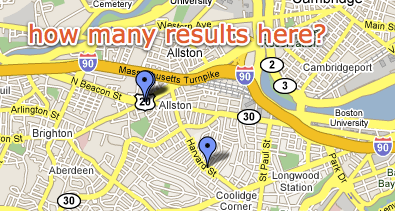
This particular map was actually sent to me by fellow Boston-area Mac developer, Paul Kafasis. He was pointing out some local restaurants I should try. But this problem is not unique to this map or even rare. In fact, often the pins line up even more perfectly, so that you literally can’t tell there are more than one at the location.
Google has tons of real-estate to work with here, but to find out what’s actually at the cluster point, I have to go back to the ugly list and click items to see where they pop up in the map. With all that space to work with, surely Google could come up with something better.
The peacock approach would work to at least allow several places to show up at one spot, yet still be clickable. The directionality of the pin makes it clear that they’re all referring to the same point.
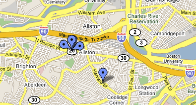
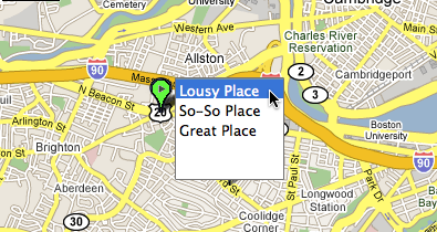
Of course, it could get complicated if nearby pins overlap with “the peacock.” Perhaps a “drop-down pin point” would be better, clearly identifying a multi-hit location with a different color and interior shape:
Surely with a feature that is so central to the map’s usefulness, Google can come up with something that improves on the current behavior.


May 29th, 2007 at 9:22 am
Google Earth solves this by letting you click on the cluster of pushpins to explode it into a constellation of separate, unambiguous pushpins.
Here are screenshots of before and after the click.
May 29th, 2007 at 9:24 am
I dig you writing more about usability and interfaces. Such suggestions are so obvious you’d really have thoughts why the Google team didn’t implement them at some point.
May 29th, 2007 at 10:50 am
Flickr has an elegant solution to this problem with their maps of geotagged photos. Take a peek at my photo map, for example.
You’ll see that locations with multiple items have a number and are sized relative to the number. Clicking one of them lets you navigate through the items at that location. Really elegant, compact solution.
Zoom in and out, you’ll see that as you get further away, more items get glommed into the same dot. As you zoom in, they separate into individual items. Nice.
May 29th, 2007 at 11:48 am
Have you tried the new “My Maps” feature? You can annotate the map, draw on it, and such, but when you go to print it, the places you marked don’t show up. What’s the point?
BONUS: Free web biz idea for someone: mashup Google maps and MLS so I can draw an area on the map, and see all of the houses for sale in that area.
May 29th, 2007 at 12:23 pm
The UK property search site Nestoria already does the peacock thing on their Google Maps results page (example screenshot).
May 29th, 2007 at 1:45 pm
I agree with Daniel. I am always wanting to rewrite programs to work the way I use them. Maybe I just use them weird or maybe I represent a bunch of users who have the same problems.
Google is no exception. I praised it at first as having a pretty good handle on usability, and I applauded the built in earth views. But lately, as I put more pressure on it, it begins to show signs of neglect. On handhelds, blackberries and such, I am finding better map solutions to replace mobile google and so may start shopping for a new desktop mapping solution. Daniel used the example of the Boston area, an area which I had to navigate recently. Boston really puts a strain on mapping software since the tunnels render GPS inoperable. I was forced to switch to MapQuest and other mapping programs to find my way around. NOTE: I still got lost.
May 29th, 2007 at 2:33 pm
The Multimap Open API has built in clustering and aggregation of markers, check out the demo page for this feature here: http://www.multimap.com/openapidocs/1.2/declutteringmarkers.htm. We put this to use throughout our new website.
May 29th, 2007 at 2:55 pm
The biggest usability gain that Google Maps could offer me is to not make the assumption that I drive a car. Unlike automobiles, we pedestrians do not have to follow one way systems when travelling from one location to another, so why not allow us to display To: and From: routes that ignore them? Grrr.
(Thank you for letting me air my Google Maps/Earth pet peeve).
May 29th, 2007 at 6:06 pm
Google Maps has several obvious deficiencies. One is that the user should be able to set a thumb tack by clicking and then have the site tell you what the closest address is. Right now the only way to get a thumb tack into an address is to know the address. I frequently know where something is (say, a ski resort up a canyon) but I’m unable to get Google Maps to find it.
A related problem is that it has very poor placement of addresses in rural areas. I’ve tried submitting feedback but with not luck.
May 29th, 2007 at 8:40 pm
Not wishing to be picky or critical, but I’d like to relate an experience in Savannah, Georgia, having gotten off a train and caught a taxi into the city.
Me: “Could you tell me where the town centre is please?”
Savannah resident: “What’s a town centre?”
Out of town shopping malls are killing the very idea and experience of town centres in the US. In several thousands of miles of travel around the US, the only place I alighted in with a genuine “town centre” was Madison, Wisconsin. A beautiful city I found, almost, dare I say it, European.
May 29th, 2007 at 9:03 pm
Transparency works well here too. If they use PNGs you can layer them and show density to a certain extent by having each one with 10% opacity. The “darker” the color, the higher density… 10 levels is decent.
May 29th, 2007 at 9:12 pm
sloan: that would work for showing the mere presence of multiples, but I also want to be able to click them of course :)
May 30th, 2007 at 9:04 pm
You mapped my neighborhood!
Agreed about the pedestrian-style directions. I do appreciate the somewhat-recent addition of subway/train stations though.
May 30th, 2007 at 10:47 pm
For showing multiple pins, at least, they could take a cue from Mail et al. and show a numbered badge over the pin(s). I also second Random John’s desire to point and click to find an address, as that would come in immensely useful, especially on Google Maps Mobile.
May 31st, 2007 at 7:31 am
daniel: true, i left off the second part, which would be on roll-over to show the detail of information. i only addressed the information density issue. :-)
this trail finder i worked on years ago has some of those ideas in it though execution is a bit off from what we envisioned (the color and background really limits data density and layering and the circle edge lines disrupt readability):
http://offroad.honda.com/family/the_riding_experience/where_to_ride/trail_finder.aspx?state=CA